Thursday, December 25, 2014

Putting The"X" in Xmas

Japanese Christmas card, 1985—
Opening it reveals a popup scene: the priest, a sugary "traditional Japanese Christmas cake"...
... Surprise!
No, that's not Who it would seem; the cartoon represents this guy. This was during his early career, as TV's popular "Beat Takeshi"—
The targets of his jokes were often the socially vulnerable, including the elderly, the handicapped, the poor, children, women, the ugly and the stupid. Complaints to the broadcaster led to censorship of some of Kitano's jokes and the editing of offensive dialogue. Kitano confirmed in a video interview that he was forbidden to access the NHK studios for five years for having exposed his body during a show when it was totally forbidden.
The explanation I got for this card is that the cartoon portrays a recurring bit on the Takeshi show. When a character does something naughty, the star materializes on a cross, hollering,
"ダメ!" ["Damé!": bad], while holding his hands in an "X"(a Japanese signal for, "No!")

Well, Christianity is exotic to most Japanese, so related trappings serve well as comic props. All in good fun... Though I have always marvelled at the US corporate connection to Sanrio's card creation...

Monday, December 1, 2014

Twelve Ways to Decorate a Dog: December


1976's crafting ends with sparkles—

A couple of special b-days—
And a variant spelling—

Saturday, November 15, 2014

Fun with Words

Sophisticated fun, 1968.

Saturday, November 1, 2014

Twelve Ways to Decorate a Dog: November


"Stacked Arrowhead Stitch is used to suggest feathers and to attach the Indian's head to the background..."

Results...

Saturday, October 18, 2014

You Say "Utopia," I Say "Me-Topia"

Lately I've been immersed in early twentieth century Japanese design history and artists. After a look at World War II textiles, via this book, I wanted to check out this title. Some of the same writers contributed to both books, and my latest read, The Brittle Decade, is a fascinating look at Japanese visual culture of the 1930s.

Elsewhere in my image browsing binge, I saw this earlier work—
Poster by Tsunetomi Kitano (1911)

Toward the top right, and just below "Kobe," the city's symbol appears on a flag seen above a flag of Japan.
This Art Nouveau beauty of a poster, publicizing a long-ago exposition at Kobe's port, reminded me of a later event there...
Other side—
"November 28 -30, 1984"

The dates should prove this event was indeed real, even though I didn't see it with my own eyes. Instead, I got the button at a Kobe trade fair I did attend, in exchange for a day's pay as an exotic foreign greeter. Compared to Meatpia, that event had a prosaic name, yet its products and atmosphere were a very odd mélange (and a story for some other time...)

Despite all alarming appearances, Japan Meatpia was (presumably) held to promote Kobe beef and other domestic products. A koala shows up here only because a vogue for the animal's image meant it was being used for every possible product or ad. And, one must always remember: there is no cognitive dissonance in Japanese marketing.

I like the button's use of a photo with red eye, which coordinates nicely with the 3-dimensional shadowed font.

The fair's name can also be explained, if in more than a few words. For starters, pia derives from utopia, and it's a routine display of Japan's love for creating odd neologisms from elements of English. Japanese automatically add an "o" between the two English consonants, when reading or saying this. Japanese syllable stress is mostly even, but pronunciation here is roughly, me-to-pía

Adding pia to names was also a marketing thing. I believe that was strongest in the Kobe area, and prompted by this—
Portopia '81 High Light [post card folder]
Images are from the nice collection of post cards and fair info here. Portopia opened March, 20 1981. Sponsored mainly by domestic corporations, it showcased current high tech to predict how Japanese would live in the future. The New York Times deemed the fair's site, Port Island, "perhaps the most impressive exhibit of all"—
The island is the result of a 15-year land reclamation project sponsored by the city government of Kobe, Japan's second busiest port. Nearly three billion cubic feet of earth were transported from hills near the city to the site in the harbor by a large conveyor belt and were poured into an area enclosed by a concrete breakwater. The result is an island about eight miles long, with housing and recreational and health facilities for a population of 20,000.
The fair certainly had its earnest side—
A third of the pavilions focus on energy or environmental issues, reflecting Japan's concern over its acute shortage of energy resources - the country must import more than 85 percent of its energy needs. The Sanyo Solarium, for example, is heated and air conditioned with solar panels, while a pavilion sponsored by the Kansai Power Company is devoted entirely to examining alternative energy sources. In one pavilion a fuel extracted from coral and the leaves of eucalyptus trees was used to operate a small motorcycle.

Several of the more spectacular pavilions highlight Japan's expertise in information technology. The Theme Pavilion, the centerpiece, houses the newly developed Hiovics, which stands for highly interactive optical visual information system, and an audience-participation video system. Visitors to the pavilion sit at individual computer booths from where their faces are projected onto a screen and their answers to a poll on Japanese ways of life are simultaneously tabulated.

At half-hour intervals, visitors are quizzed about their preferences in studying, eating and leisure activities. Based on their answers, the computer compiles a vision of the future that the respondents say they prefer. The results indicate that the Japanese want more time for sports and recreation.
The Times noted such futuristic wonders as "computers that compose music, dancing robots and hemispheric screens that project dazzling optical illusions." It was the largest high tech exposition since Osaka Expo '70.

Portopia lacked the international participation of 1970, being, as the Times said, "sponsored by the Japanese for the Japanese." Presentations combined technology, entertainment, and—what else?—pia
"Heart-Pia" Fun-With-Water Pavilion
Uncaptioned card (Heartpia and robot)
"Internationalism," Japanese-style, made appearances. Exotic and futuristic—
International Plaza
Exotic and quaint—
Souvenirs and food in the Avenue of Foreigners have their own exotic flavor
Another kind of exotic and foreign—
The Panda - The Popular Fellow from China
1981: Panda not yet eclipsed by the korara boomu ("koala boom"), or the mid-80s flirtation with erimaki tokage.

Seventy years earlier: a glimpse of the port, as seen between the Art Nouveau draperies—

In 1981 a Kobe Port Island Exhibition Association's brochure estimated a Port Island "daytime population of about 70,000 in 1985." Over two decades later—
Port Island distant view from Shisho-Zan mountain, Kobe, Japan
Photo: pinqui, 14 June 2008
Before Portopia's opening, an automated train system linking Downtown Kobe with Port Island was built. Along with the event's ultimate legacy of convention centers, hotels and an airport, the island was developed as a bedroom community of high-rise condos and suburban amenities.

Speaking of landfill... I occasionally visited friends who lived in one of those condos, the only times I went to Port Island. More often, some of my work commutes passed a development in the next town to the east. While it was much smaller and less glitzy than the Kobe site, it did have some rather surreal apartments rising from waterfront landfill. I've located only these small photos, and they don't quite capture how odd "Ashiya Newtown" looked—
Those are part of this interesting photo grouping.

Wednesday, October 1, 2014

Twelve Ways to Decorate a Dog: October

October's pooch—m.a.d....

..."Machine Appliqué dog," that is—

And October 1976 had a dual celebration—

Saturday, September 20, 2014

Divided Attention

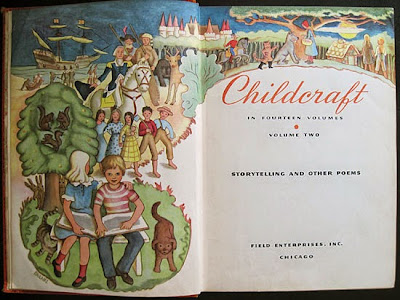
Childcraft (v 2): Storytelling and Other Poems
1949 - Field Enterprises, Chicago
It seems this volume first appeared in 1923, as The Child's Treasury. The original publisher, W.F. Quarrie & Company, issued several editions into the 1930s; editions from 1939 to 1947 were published by the Quarrie Corporation.

Fields Enterprises (headed by an heir to Marshall Field) had moved into publishing by buying The Chicago Sun in 1944. From 1945 to 1978 the company owned the World Book encyclopedia. It seems the Childcraft series also was marketed by encyclopedia salesmen.

Other titles in series.

Endpapers—
The text has at least one illustration for page, with a single artist illustrating a 2-page spread. As a number of different artists are represented, the book is interesting for variations in period styles aimed at children.


Text is grouped in three sections: "Poems for Everyday," "Humorous Poems," "Storytelling Poems and Ballads."

Near the end is this colorful spread—

Patriotism here—

Followed by some broadening of the sales market—

I'll have to get to more illustrations in future, but another item of interest for now is an item left in the book. It would seem that around the 1980s, this copy was handed down to a child with more up-to-date daydreams than those the Fields Co. promoted—
Page from a tear-out sticker book (to scale)

Wednesday, August 20, 2014

Under the Blue, White and Red

In a jumbled pile of thrift shop scarves J. spotted this bit of history—
Rayon scarf, app. 69 cm by 71 cm (27 by 28 ")
During World War II, clothing manufacturers used rayon to replace unavailable silk. Although the European war didn't end until May 8, 1945 (VE Day), this scarf might have been made any time after the August 25, 1944 liberation of Paris it commemorates.
Photo: Robert Capa
This month happens to mark the 70th anniversary. The distance is evident in France's political swings to the right, and in the latter's usual efforts at re-writing history.

But this scarf represents an historic moment in Paris, 1944.

From Sacré-Coeur at the city's highest point—

The steps of Montmartre sweep down to a city full of flags, banners, and jubilant cartoon characters.


The whole scene surrounded by victory slogans—


"Vive Les Sammies"—

This was a new one on me, and I didn't get it. But (as usual) J. did: "Sammies" for "Uncle Sam." This appears to date from World War I, when it was used by both French and British soldiers.

There doesn't seem much to be found (even in French) on designer Denise Louvet.

But the textile house was well-known. Its trademark, the Place Vendôme Column, denoted the shop's Paris location.
Some period ads are here. This is the shop in 1937—
The patriotic color schemes of these ads are from 1945—


By an interesting coincidence, J. found this scarf just after I had read Wearing Propaganda: Textiles on the Home Front in Japan, Britain, and the United States. The book was published in conjunction with this exhibit, curated by author Jacqueline Atkins.

It was fascinating to see how the French scarf continues the British and American war-time theme of morale-boosting messages printed on textiles. The chapter in Atkins' book devoted to English scarves, "London Squares," is written by graphic design collector and historian Paul Rennie. Rennie has a pdf of the material posted here. Illustrations are unfortunately small and low resolution, but Rennie's text offers some interesting social history of wartime Britain as background to propaganda scarf manufacture.

With their increased wartime presence in factories, women were admonished to cover their hair for safety—
Poster: F. Kenwood Giles, 1941
Imperial War Museum


Rennie writes that—
The scarf became, in the context of war work, an important element in safety awareness and part of the proper uniform of the female industrial workforce. These fashion notes were further emphasised through a discourse of make-do-and-mend and also in the pages of the fashion press. The pages of "Vogue" championed the active participation of women in the war effort and ran features on work wear and propaganda textiles.
(Some material on British Vogue's work at the behest of the government is here.)

Two English design houses of note, Jacqmar and Ascher, produced "up-market" scarves. Rennie offers some fascinating social background—
The designs produced by Jacqmar are unashamedly aimed at an economy of exchange between wartime sweethearts in London. The existence of designs aimed at American personnel, the Free French and Poles in London serve as a reminder that, whatever the official line, fraternisation between these different groups was popular. The existence of these textiles is evidence of a social transformation in London during WW2. The pursuit of an export market as a national priority during and after the war placed a premium of these products at home. The company office in Mayfair identified the products and brand as high class, as did the relatively expensive price point of the products.
(A friendship scarf example from the Imperial War Museum, along with other collection links, is here.)

Jacqmar's graphic style was one of
... dynamic and expressive line drawing. The inexact registration of colour blocks over the line give a pleasing looseness to the design and hint at "cubist" influences.
This short piece includes a nice slide show of Jacqmar samples from another collector. Even when scarf designs featured such text as war-time slogans, Jacqmar's style was particularly jaunty. This one was manufactured after the US had joined the war—
"Jacqmar Presents" featured catch phrases of BBC radio programs—

This collector suggests that, at war office request, Jacqmar did subtle pro-French propaganda with this—

It's hard to beat those colorful, clever peintures. Still, J's scarf was an amazing find, with an historic moment expressed in period graphic style.

The perfect souvenir for a Sammie in post-war France to bring home.