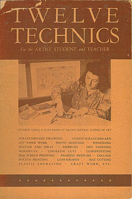
Sunday, November 27, 2011

Acrobatics

After managing to breathe for a couple of days, the work week already looms; tomorrow, it's back to being expected to juggle thirty things at once, while bending over backwards to please those with unreasonable expectations...

Though I'm far from graceful at it, I'm reminded of—
Well, with my boss' negligence causing a pile of backlogged "priority" work to get to me at the last possible moment before the holiday, I know what awaits tomorrow—and the only thing spinning in the cubicle will be my head.

"Plate-spinning" image is c. 1970s—from a set of eleven post cards, published by Shanghai People's Publishing House—
At least this is not in my job description—
Cycling act
A douze sur une bicyclette
(The French caption clued me in; I had to really look, to see the twelfth person...)

Some other acts—

Acrobatics on poles
Acrobaties á la perche
Balancing on a ladder
Equilibre sur une échelle
Less strenuous, perhaps, but I like the way the performers are just so perky, as they go about The People's entertainment—
Conjuring
Prestidigitation

Diabolo Play
Diabolos

Thursday, November 24, 2011

Wheeee...!

Two days' holiday followed by a weekend; the euphoria brings this to mind—Souvenir of a childhood trip; enlarged details on reverse—
This must have been two or three years before the park closed (1964, says Wiki). As I remember—and as family photos suggest—the attractions were pretty limited by then, so it seems it would have been hard to use up ten punches.

There are snaps of me on two rides (sister J was too young for them). No picture, but I went on a jerky steeplechase ride, too, and can remember how creaky and antique the structure seemed. I also remember the steeplechase structure and horses as being monochrome wood, though the tinted post cards here and here give an idea of the course's design. (Another view, this photo.)

In the park's heyday, it was a 1930s haunt of Reginald Marsh, out to paint all that fleshy humanity in search of excitement...
George C. Tilyou's Steeplechase Park; image found here.

The Brooklyn Museum has another Marsh painting of the same scene: The Bowl, 1933. (Thumbnail and details.)

The Bowl, c. 1961: not packed, and strictly for kids—

Sunday, November 20, 2011

Xacto Technics

c. 1942-45
Inside cover note—
In connection with World War II, scale models of aircraft, many of them made in our schools, have played a vital role. In making these X-ACTO has been in constant demand. If you wish to learn more about this, we'll gladly send you a copy of our booklet, "How to Build Scale Models for Defense," on receipt of 10 cents to cover mailing costs.
Before spotting that reference to the war, I assumed this booklet was about ten years older, as the xacto knife technique illustrations (which may be from an earlier printing) seem heavy on subjects from the 1930s.

Reminiscent of the 1930 Little Caesar, the bursting out of the frame energy in this portrait of Edward G...

...has him duded up, as in Caesar's "testimonial" scene.

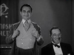
Soon after the start of the '30s crime movies would be toned down, due to stronger industry enforcement of the Hollywood Production Code.

And before the decade's end, ambitious actors like Edward G. Robinson and James Cagney were eager to escape "tough guy" typecasting. After both won contracts giving them role and story control, they played law-abiding characters as well as gangsters, and played the later only occasionally, when project quality warranted it. (See for example, discussion in Thomas Schatz, The Genius of the System, 1988, page 302.)

Of other period notables, there's this—

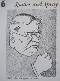
"Spatter and spray" indeed! This 1937 Life cover story, "Some Senators Look Like Senators," includes Johnson, called "a thunderous orator, most effective when in opposition."

Wiki also notes—
In 1916 Johnson ran successfully for the U.S. Senate, assuming office on March 16, 1917. It is alleged that was the year that he spoke the words for which he is best remembered today: "The first casualty when war comes is truth," referring to the United States's entry into World War I.
A quote which, if not a completely new thought, is associated with Johnson in that particular wording.

Other celebrated figures of the era include—

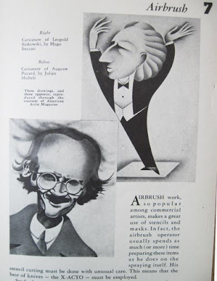
Leopold Stokowski's celebrity began in the 1930s.
Full-page ad, National Geographic, February 1932
Wiki lists the Hollywood features he appeared in: starting with the The Big Broadcast of 1937, he appeared in others before his greatest success, Disney's Fantasia (1939).

I have a 1933 National Geographic with a long feature by
Auguste Piccard, Ballooning in the Stratosphere.
"With 34 Illustrations" and subtitled, Two Balloon Ascents Presage New Mode of Aërial Travel, the article covers the high-altitude flights and vehicle experimentation that had brought Piccard international fame since the start of the decade. The life and work of the physics professor—plus a face and tall, skinny frame made for caricature—inspired a fellow resident of Brussels to use Piccard as the basis for a character in Tintin.

Of other "professional work" illustrations, I like the period surrealist-inspired ad art—

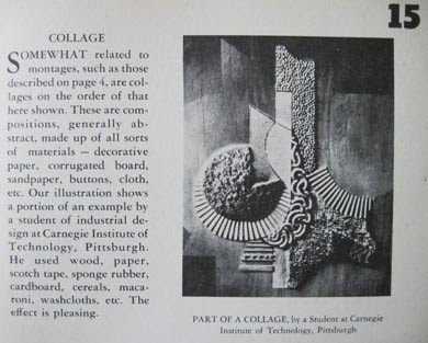
"Student work" examples range from grade school to one by a Carnegie Institute of Technology student, whose collage
used wood, paper, scotch tape, sponge rubber, cardboard, cereals, macaroni, etc.
Just about everything but the kitchen sink... "The effect is pleasing," the brochure makes sure to inform us.

Xacto offers this company history
X-ACTO was founded in 1917 by Sundel Doniger from New York City. The company started by producing syringes for the medical profession, and in the early 1930's began manufacturing precision surgical blades with a unique handle that accommodated a variety of interchangeable, replaceable scalpels. However, the X-ACTO blade that became the industry standard was created when an X-ACTO advertising artist needed a retouching knife. Doniger created one from his employee's sketch, and it worked so well that the company began manufacturing the product for other artists and hobbyists.
Too bad there are no historical images posted. I'd especially be interested in the dates when the company used this logo—
It's typical of the "Funny Little Man" design motif of the '20s and '30s. [Review of Virginia Smith's book.]

Product design history also would be interesting.

Well, I particularly covet the "handy wooden Knife Chest, natural finish $3.50"

Monday, November 14, 2011

Art + Food Labels: Another Country Heard From

And, in marrying Famous Art to food packaging, that country will not be outdone.

With this Japanese product of the mid-1980s, the use of European masterpieces was as literal as could be: biscuits topped by molded chocolate reproductions of art works—


In good Japanese product education style, each work is explained for maximum consumer enlightenment. This applies not only to the merchandise, but also to the cultural artifacts represented—


Stats for each work of art are laid out: title, year created, dimensions of the piece, medium used, artist's name, and other identifying details—


These cookies were a common item, until disappearing at some point around '86 or '87. I missed them; they were tasty, along with providing entertaining and informative box reading.

They also provided odd associations at snack time.

After all, it was interesting that the subsidiary of a major U.S. brand would sell a product suggesting consumers munch on

Or take a naughty bite out of

For Export Only?

Well, there I was in Big Lots, home of mystery brands.

I was out of oil, the price was good...and, how could I resist this label?


Although something tells me their name isn't "Botticelli," there may be a fine Italian family behind this product, as the company's proclaimed "five generations of experience" tries to suggest.

It's perfectly good oil, and I've gone through half the bottle in a few months.

Luckily, that was before reading the taster reviews here...
While a few tasters liked this "potent" oil, others said they detected "mushroom," "rotten walnuts," "a Band-Aid wrapped in a cherry blossom," and a quality that was "downright medicinal-Triaminic, anyone?" Several deemed it "overpowering" and "musky," with a "rank, off-flavor." "Tastes not like olives but like the armpits of olive laborers," shuddered one.
I quote those for entertainment purposes only; I may have been lucky, but my batch tastes fine.

But then, I am a sucker for this kind of labeling.

There was that can of tomatoes schlepped from Canada in the early 1990s, just for the label that's been part of my kitchen décor ever since:

I don't know if this packaging is a tipoff that the products are for export. Italians certainly have a cultural legacy to advertise, but I never saw this kind of product labeling while traveling there. While playing up the glories of the Italian Renaissance to outsiders may be good marketing, perhaps Italians feel secure enough in knowing about this stuff that they don't need to be reminded by a "musterpiece" on an everyday product—

In any case, I like the overly dramatic linkage of label with content.

From on high: the creation of man...

And, a nice can of peeled tomatoes!

Sunday, November 13, 2011

Madame La Jeanne of Kalamazoo

From the "Free" table at a rummage sale: Sister J. picked up the items below, for a friend who collects such things.

Not that I, who scan and take pictures of the stuff, am in a position to criticize other people's hobbies—

Instructions for use—The design is possibly from the late 1940s or early 1950s, though there's no telling when these may have been produced, or how long the company was in business. The penciled price is likely original—from the days of 5 and 10¢ stores, and small local businesses like dry goods shops.

From time to time, J. reminds me of how the old Woolworth stores had consistent stock, year after year—goods made by U.S. companies, some which must have been small factories making a single product for a dependable retailer. J. also reminds me that, despite the cheapness of Woolworth's goods, the quality was vastly superior to almost anything we can find now.

"La Jeanne": an American small manufacturer from the days before quick turnover of truly shoddy products—no need to do more than slap a designer label on 'em.

Tuesday, November 1, 2011

November - Card of the Month

Japanese post card, c. 1960s-1970s; captioned on reverse—
"Shichi-Go-San," Children's Shrine Visiting Day – November 15

On this date, girls of seven ("Shichi" means seven in Japanese), boys of five ("Go") and boys and girls of three ("San"), wearing their best dresses, go to the local shrines accompanied by their parents to pray for future blessing upon them.